


A memo released last week by US Secretary of State Marco Rubio revealed the latest target in the Trump administration’s ongoing mission to dismantle DEIA initiatives in the federal government: fonts.
Yes, you heard that right. Fonts.
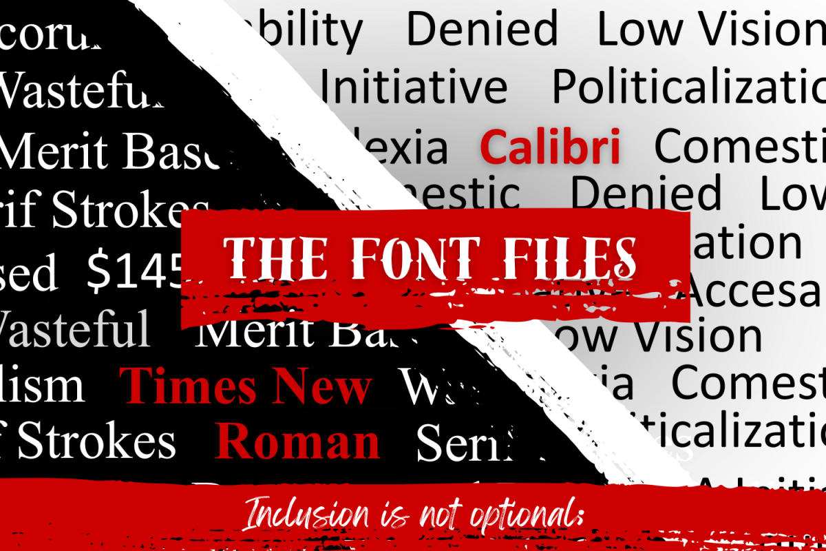
On Tuesday, December 9, Rubio ordered all diplomatic correspondence to readopt Times New Roman as the standard typeface for US government documents. The directive reversed an order made in 2023 by then-Secretary of State Antony Blinken that had established Calibri as the agency’s official font.
In a cable sent to all US diplomatic posts regarding the changes, Rubio justified the decision, stating, “To restore decorum and professionalism to the Department’s written work products and abolish yet another wasteful DEIA program, the Department is returning to Times New Roman as its standard typeface.”
The “wasteful” change Rubio overturned, however, was not one made for aesthetics. Blinken’s switch to Calibri had been intended to increase accessibility for those with disabilities. Calibri is a sans serif font, and therefore lacks the decorative flourishes, called serifs, present on the end strokes of fonts like Times New Roman. These added serif strokes, while traditional, can cause problems for readers with low vision or learning differences, especially at smaller text sizes where the added marks can interfere with letter recognition.
Because of this, sans serif fonts are generally preferred for their cleaner lines and simpler designs. This preference is not a niche trend; it is widely reflected in the federal government’s own accessibility standards. The Americans with Disabilities Act, for example, requires the use of sans serif fonts on signage as they are easier to read quickly and accurately.
Rubio, however, claims that the switch to Calibri failed to meet its accessibility goals.
“Although switching to Calibri was not among the department’s most illegal, immoral, radical or wasteful instances of DEI it was nonetheless cosmetic,” Rubio asserted in the state department cable.
As reported by the Associated Press, Rubio also claimed that the change had cost the department $145,000, though no evidence was offered to support this claim. He also noted several other alleged issues with the use of Calibri, arguing that it clashed with the style of the State Department letterhead and was not suitable for the formality of official US documents.
While it is easy to dismiss this change as trivial, the problem here isn’t just about design choices or font preferences; it is the labeling of accessibility programs as “wasteful” or “cosmetic” that should raise concern.
Rubio’s decision reflects a wider trend in the politicization and dismissal of accessibility initiatives. Over the last year, the Trump Administration has begun a major effort to terminate diversity, equity, inclusion, and accessibility (DEIA) programs in the federal government. Supporters of DEIA initiatives argue that they are a necessary step in ensuring historically marginalized groups are included, while opponents claim that such programs may be discriminatory and threaten to undermine merit-based hiring practices.
Unfortunately, several actions taken by the administration aligning with anti-DEIA policies have threatened accessibility far beyond font choices. One of the clearest examples of this can be found in the Trump administration’s ongoing lawsuit with the National Association for the Deaf (NAD). Throughout both his terms, Trump has challenged the use of an interpreter during events like White House press briefings. In May, the NAD sued his administration following the cessation of American Sign Language interpretation, a practice used regularly during the Biden administration.
According to the NAD, the decision effectively denied “hundreds of thousands of deaf Americans meaningful access to the White House’s real-time communications on various issues of national and international import.” In response, attorneys from the US Department of Justice argued that being required to provide interpretation would “severely intrude on the President’s prerogative to control the image he presents to the public.” No elaboration was provided on how ASL interpretation would inhibit Trump’s public portrayal.
Ultimately, each of these examples represents an alarming characterization of accessibility as unnecessary and even damaging. When initiatives designed to level the playing field, promote participation, and ensure equal access are written off as, in the words of Rubio, “wasteful” or “cosmetic,” the message being implied is that those with disabilities are not worth the effort of inclusion.
This couldn’t be further from the truth.
Accessibility programs ensure that everyone has equitable access to information and, as a result, the ability to take part in political discussions. Inclusion isn’t unprofessional, nor is it optional. Casting aside accessibility for the sake of cosmetic preferences isn’t a pattern that should continue unopposed.
Times New Roman may be back, but the idea that accessibility is optional should have been retired long ago.
Fonts aren’t unprofessional. A lack of accessibility is.